Pantone, the world-renowned authority on color, announced its decision for Color of the Year 2016. While 2014 and 2015 brought deep and bright colors with Radiant Orchid and Marsala, the coming year will have a much softer approach. Pantone’s choice, or rather choices, have sent the design world into a tizzy. That’s right. Pantone selected two colors–an unprecedented move. Sharing the coveted title in 2016 are soft shades of pink and blue: Rose Quartz and Serenity. While the world speculates about the implications and political agenda of the pairing, we are jumping to the practical side of things to give you what you really want–ideas for incorporating the color of the year into your home.
 Use Pink
While you might not envision using the baby pink color of Rose Quartz outside a little girl’s room, we’re here to show you that it can be quite stunning in a grown-up space. In a room made up of mostly neutrals, pops of pink add a sophisticated and alluring look. Rather than feeling stuffy, the room radiates an air of upscale charm while remaining serene and comfortable. Just a few carefully selected pink accents bring a warmth and beauty that fills the whole space. Impressed with the mature and contemporary look of a color that’s usually reserved for kids? We are too, and we’d love to help you infuse this color of the year into your home with custom fabrics and window treatments.

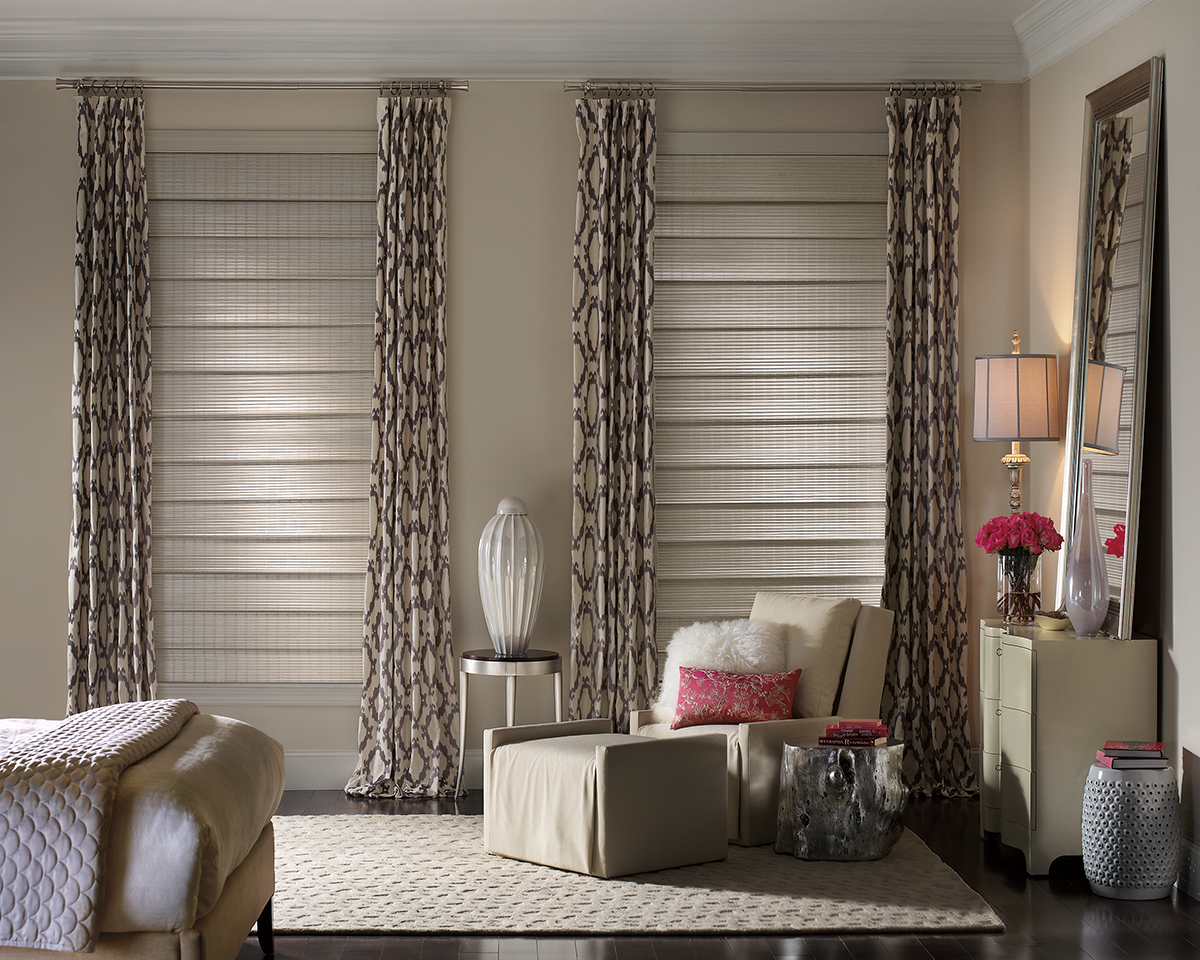
Use Blue
There’s a reason the blue hue of 2016’s color of the year pairing is called Serenity. It embodies calmness, peace, and tranquility, and it ushers those feelings into any space where it’s present. In this livingroom, Silhouette window shades allow a gorgeous view-through so that the softness of the blue furniture and design elements connects with the whispy sky. Nature’s beauty and soothing presence feel as much a part of the room as the sofa and area rug. If you long to have a serene oasis like this, we can help you with window coverings and fabrics that will add extraordinary beauty, style, and relaxation to your home.
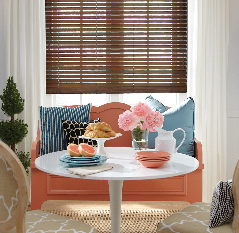
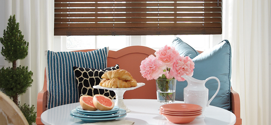
Use Both
While the selection of two colors for the Color of the Year 2016 came as a big surprise, so did the fact that the contrast of Rose Quartz and Serenity creates such incredible harmony. In today’s world, pink and blue are generally considered opposites. We’ve all heard the cliche that opposites attract; well, it couldn’t be more true in this case. Mixing the two colors in one space blends the warmth and fun of pink with the coolness and sincerity of blue for a refreshing and composed look that captivates. You can see that here as the full pink florals add a whimsical charm that’s both offset and pulled together by the classic look of the striped blue accent pillow. Feeling captivated? Why not embrace the color of the year duo and bring a sense of allure to your spaces. Our design experts would love to help you do just that!
Pantone really shook things up this year with their announcement of two colors for the Color of the Year 2016. We’re excited to see what fashion and interior design does with Rose Quartz and Serenity in the coming year. We’re also excited to see what you do with it! If you’re feeling inspired by the groundbreaking trend that Pantone has started, we want to help you achieve the amazing look you’re imagining for your home. Fabrics, window treatments, expert advice…we have just what you need here at Bazaar Home Decorating. So, contact us for a free, in-home consultation.